YCD 5K Fundraising Event: Energizing Community Support through Bold Design
Scope:
Brand Identity
Event Collateral Design
Merchandise Design
Collaborating with YCD to Empower Bayview-Hunters Point
For over a year, I’ve had the privilege of working alongside Young Community Developers (YCD), an organization dedicated to uplifting the Bayview-Hunters Point community in San Francisco. YCD’s mission is to break the cycle of generational poverty by providing workforce training, educational services, and housing opportunities to those who need it most, with an emphasis on community youth.
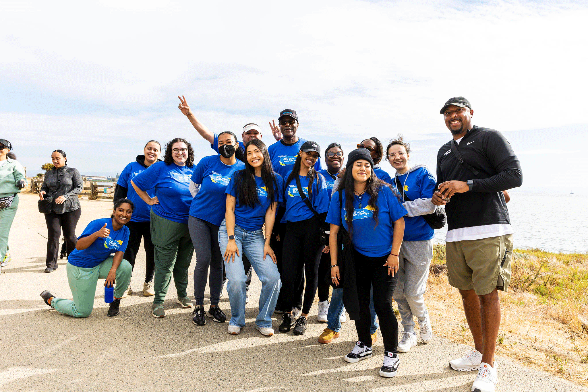
Credit: Anthony Weaver www.aweaverphoto.com
As a long-distance running enthusiast, I was so excited when YCD approached me with their vision for the inception of their inaugural 5k race: We Run Bayview 5K.. The race would serve not only as a fundraiser but as a celebration of all the hidden gems that Bayview-Hunters Point has to offer. This event was a chance to showcase the strength and beauty of this vibrant community, and it was a huge honor and responsibility to translate that intothe visual identity and collateral for the event.
Process: Building a Visual Identity Full of Energy
When we began brainstorming for the 5K race, one of the key things we wanted to communicate was energy—the energy of the participants, the passion of the community, and the excitement of the event itself. Our early conversations were filled with ideas about bold colors, playful shapes, and dynamic visuals that would make the event feel as fun and lively as possible.
We took inspiration from the idea of dramatic paper rips—a visual metaphor for breaking barriers and overcoming challenges. These visual elements became central to the overall branding for the race, symbolizing both the toughness and joy of running, as well as the resilience of the Bayview-Hunters Point community.
The Brand Identity: Bold, Electric Colors and Playful Visuals
The brand identity we created for the YCD 5K event was designed to be fun, warm, and visually impactful. We wanted something that would catch people’s attention while also conveying a sense of community and excitement. To achieve this, we used bold, electric colors paired with playful, dynamic visuals that echoed the paper rip concept.
From the logo to the brand guide, each element was carefully crafted to reflect the energetic and welcoming spirit of both the event and YCD’s mission. The logo itself became a symbol of unity and motion—representing not only the runners but also the broader goals of the organization to keep moving forward and making progress for the community.
Expanding the Brand: Designing Marketing Collateral and Merch & Event Design
Once the brand identity was established, we expanded those core visual elements into various collateral for the event. This included everything from participant merchandise to sponsorship forms and day-of signage, all designed to maintain the same bold, energetic vibe.
Marketing Collateral:
To ensure the YCD 5K reached its full potential as both a fundraiser and a community event, we created a suite of marketing collateral that would generate excitement and engagement. The sponsorship forms were crafted to be both informative and visually compelling, using the bold event branding to attract potential sponsors and highlight the impact of their support. For social media, we developed a series of vibrant, shareable posts to spread the word across platforms, each showcasing the event’s energetic visuals and encouraging community involvement. Lastly, the event landing page served as a one-stop hub for race details, registrations, and donations, providing a seamless user experience that was both inviting and aligned with the brand’s fun, electric identity.
Merch and Event Design :
For our Merch and Event Design, we aimed to create items and visuals that participants would cherish long after race day. This cohesive branding extended to event signage, with lively designs on parking markers, check-in banners, and mile markers, ensuring every runner and supporter felt the race’s energy from start to finish. The unified look across merchandise and event visuals enhanced the overall experience, making each element memorable.
A Race to Remember, A Community United
The YCD 5K event was more than just a fundraiser—it was a celebration of the Bayview-Hunters Point community and the incredible work that YCD does every day. Through the bold brand identity and energetic event design, we were able to create an experience that resonated with participants and brought people together in support of a great cause.
With the success of this event, YCD has a visual identity for future fundraisers that continues to reflect their dedication to empowering the community and creating lasting change.
Credit: Anthony Weaver www.aweaverphoto.com


